|
|
Date: 2005
Project Type: Generative

Exercise for Ethan Ham's
Email Erosion
Description
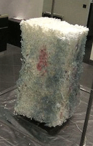
Email Erosion (EE) is a computer-operated installation (also viewable via webcam) that automatically creates sculptures when it receives an email. EE has roots in conceptual art because its activity is centered around a set of instructions. It also relates to data visualization, or the aesthetic presentation of text or numerical information. In EE, a block of biodegradable styrofoam is surrounded by a steel frame. When triggered by the contents of emails, a mobile mechanism sprays water on the foam and causes it to slowly dissolve.
Note: this exercise is difficult, and best suited for students with some familiarity with online communication.
Purpose
To consider how data can be visualized in forms that are not text or number-based.
Exercise
Warm-Up Activity (5min): View different population charts: a bar chart, pie chart, histogram, and scatterplot. The educator should lead students in a brief discussion that touches upon each one. Suggested questions could include:
- What are the names of the different graphs?
- Which one best represents the information?
- Do any represent the original data in a way that seems inaccurate?
Play (10 min):Students should scroll through Email Erosion, browsing the emails and seeing how each one creates a different foam sculpture.
Follow-Up Exercise (10 min): The educator should introduce the terms conceptual art and data visualization and guide students in an interpretative discussion of the piece. Suggested questions could include:
- What is an email made of? For instance, subject, sender, body text?
- What connections can be made between the original emails and the sculpture? Is their content reflected in the sculptural form? Does the sculpture evoke email communication?
- Do students think that email is a valid subject for a piece of art?
- Do students enjoy the piece in its online form?
Activity (25 min): Students should quantify how they spend their time in a day, according to half hour segments. The following are sample categories, but students should feel free to create their own categories:
- Listening to music
- Getting dressed
- Friends
- Eating
- Cooking
- Homework
- At school
- Working
- Family
- Sleep
- Playing television
- Watching video games
Students should first lay this information out in a basic line chart. Next, they should transform it into either a bar chart or a pie chart. Finally, they should come up with an original way to visualize the information, be it a drawing or with words in different sizes. The educator should provide examples of data visualization that will guide them.
|