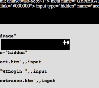
Splash art originated in the 1940s in comics, where the term referred to a full page of visuals at the front of a book. Pages were designed to engage the reader's imagination along the lines of the comic's broader concept, while standing independent from the narrative. In the late 1990s, when the widespread use of the application Flash opened up new possibilities for animation and interactive media, the idea of the splash page migrated to web design. Online splash art brought visual excitement to a webpage when low modem speeds made it impractical to post large or moving images amid a site's textual content.
Rhizome introduced splash pages to its web site in 1998 in order to display artwork with greater immediacy....
Rhizome introduced splash pages to its web site in 1998 in order to display artwork with greater immediacy....
Launch Project 
 %20wrong (RHIZOME--splash%20_%20JODI%20%_), 1998
About
The art of JODI simulates dead ends and errors, with additional tweaks of the interface to further frustrate the viewer. In %20wrong (RHIZOME--splash%20_%20JODI%20%_), a black strobe prevents users from even attempting to read cryptic lines of code on a gray field. The only constantly legible element is the spinning, quartered black-and-white disk that signified a delay on old Macintoshes. It functions as a piece of bait, since clicking on the rectangle around the disk sends users to Rhizome. Splash art is a natural medium for JODI, a collaboration by artists Joan Heemskerk and Dirk Paesmans, who have never framed their work with texts and statements. Their projects consistently occupy the entire browser window.
http://wwwwwwwww.jodi.org/
http://wwwwwwwww.jodi.org/