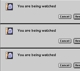
Splash art originated in the 1940s in comics, where the term referred to a full page of visuals at the front of a book. Pages were designed to engage the reader's imagination along the lines of the comic's broader concept, while standing independent from the narrative. In the late 1990s, when the widespread use of the application Flash opened up new possibilities for animation and interactive media, the idea of the splash page migrated to web design. Online splash art brought visual excitement to a webpage when low modem speeds made it impractical to post large or moving images amid a site's textual content.
Rhizome introduced splash pages to its web site in 1998 in order to display artwork with greater immediacy....
Rhizome introduced splash pages to its web site in 1998 in order to display artwork with greater immediacy....
Launch Project 
 Subculture: Rhizome, 2001
About
The "cancel" and "resume" buttons on tiled boxes locate the source of their design as standard pop-up messages on a Mac. But the text in each one—"You are being watched"—is new. It is a reminder of the perpetual surveillance on the web, where each user's data are subject to constant collection. Shaky animation and a dissonant, looped squeal intensify the message's urgency. The splash page has the speedy, sweaty-palmed feel typical of the work of Los Angeles-based artist Antonio Mendoza, whose web sites bear mottos like "the.web.on.crack." His art gives form to the dangers and fears associated with internet use.
http://www.subculture.com
http://www.subculture.com