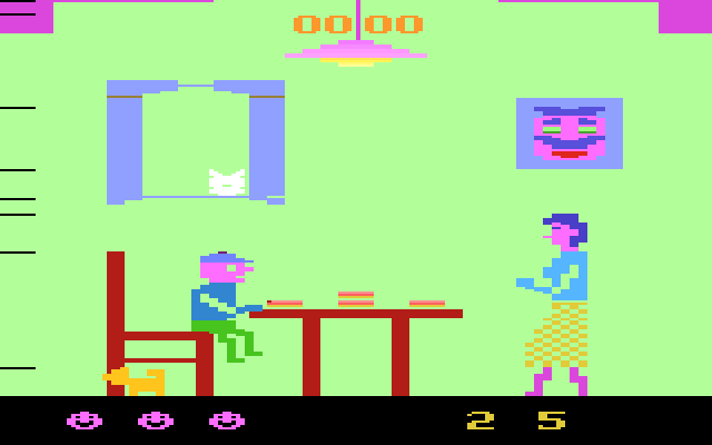
 This ultra-rare game is the most bizarre thing I’ve ever seen on an Atari 2600. The word “mangia” (pronounced mon’ ja) is an Italian word meaning “to eat”. This unusual game is set in a kitchen, where a mother is serving pasta to her kid. The characters are huge and detailed, but somewhat creepy-looking. Each time the mom returns to the table, she heaps more food on the kid’s plate. As the kid, your job is to dispose of the food – any way you can! Sure, you can eat it, but if you eat too much your stomach will expand and eventually explode. That’s right – the game actually depicts the poor kid’s stomach bursting into a pixilated mess! Can you believe it? I’m telling you, Mortal Kombat has nothing on Mangia! Anyhow, to prevent this gruesome tragedy for occurring, periodically toss some of the food to the cat in the window or the dog under the table. The problem is, these pets only appear intermittently, and you can only toss the food when mom’s back is turned. If caught, she’ll bring THREE helpings of food at a time, and too much food will break the table legs, costing you a life. Doesn’t this game sound like a twisted nightmare? It reminded me a bit of the movie Seven. The controls utilize the joystick only (no fire button), with Street Fighter-like joystick sweeps used to sling food. Sound effects include an irritating ring that blares whenever the cat appears. A nice Italian song is played between levels, but you’ll soon get sick of it. Mangia’s gameplay held my attention a while, but after you get the hang of it, it gets really long and repetitive. I’ll give the game credit for being original (and somewhat disturbing), but it’s more novelty than anything else.
(from The Video Game Critic’s Atari 2600 reviews… sounds pretty good to me)
— guthrie 8/29/06 10:14 pm
* btw also check out travis’ awesome thumbnail collages on a.u.t.
— guthrie 8/29/06 5:19 pm

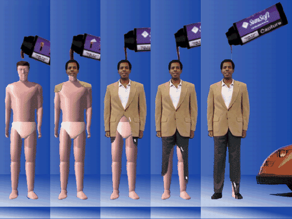
I kept wanting to put this movie file into some project or something, but it’s just too good by itself… I love the boring blue void, and the 3d white guy model getting liquidly “texture mapped” into a black guy. The whole thing is just so goofy.
From the source:
The Plot
Julie and her colleague want to use a character from an old company TV commercial for their current car project. Using the “magic wand” imagetool they grab the character’s image out of the archived video.
— guthrie 8/25/06 2:40 pm
A while ago, I decided to write some fanmail to the authors of my favorite homepages…
I sent one to the creator of the My Most Boring Dreams website (which is hilariously boring, and just looks perfect – its brevity and isolation…) I guessed the author’s email from the URL, and his response was interesting because it goes so perfectly with his dreams & the layout of his website:
Hi,
You know, I haven’t had any that boring for a while now, and I’m kind of disappointed. Glad you enjoy the one that are there, and thanks for the email! When I have more boring dreams I will post them.
Ted
(I really love that there are only 3 dreams on the website, and all their exact dates are vague… sort of resembles a handmade blog.)
No one else that I emailed really replied, which I was very bummed about – but I still really want to make some kind of connection with my fave homepage authors… it’s possible a lot of their email addresses are outdated. I did contact Marco Melanson on Myspace about buying one of his paper records, but he said that he was too busy to make any for me.
Later, Steve DeGroof, the author of a homepage that I included in one of my lectures found my lecture online by googling his own name… This ominous picture of me standing in front of a huge projection of his homepage is the first image that comes up when you google his name! That would freak me out too. He was concerned that maybe I was featuring his website as an example of bad design or something like that. I told him that I loved his website’s how-to’s & its simple style, and he seemed to be cool with it.
— guthrie 8/15/06 3:33 pm
 This ultra-rare game is the most bizarre thing I’ve ever seen on an Atari 2600. The word “mangia” (pronounced mon’ ja) is an Italian word meaning “to eat”. This unusual game is set in a kitchen, where a mother is serving pasta to her kid. The characters are huge and detailed, but somewhat creepy-looking. Each time the mom returns to the table, she heaps more food on the kid’s plate. As the kid, your job is to dispose of the food – any way you can! Sure, you can eat it, but if you eat too much your stomach will expand and eventually explode. That’s right – the game actually depicts the poor kid’s stomach bursting into a pixilated mess! Can you believe it? I’m telling you, Mortal Kombat has nothing on Mangia! Anyhow, to prevent this gruesome tragedy for occurring, periodically toss some of the food to the cat in the window or the dog under the table. The problem is, these pets only appear intermittently, and you can only toss the food when mom’s back is turned. If caught, she’ll bring THREE helpings of food at a time, and too much food will break the table legs, costing you a life. Doesn’t this game sound like a twisted nightmare? It reminded me a bit of the movie Seven. The controls utilize the joystick only (no fire button), with Street Fighter-like joystick sweeps used to sling food. Sound effects include an irritating ring that blares whenever the cat appears. A nice Italian song is played between levels, but you’ll soon get sick of it. Mangia’s gameplay held my attention a while, but after you get the hang of it, it gets really long and repetitive. I’ll give the game credit for being original (and somewhat disturbing), but it’s more novelty than anything else.


