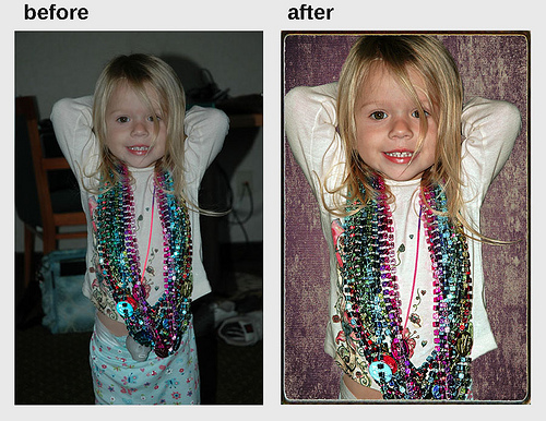
examples of photo-repair services available
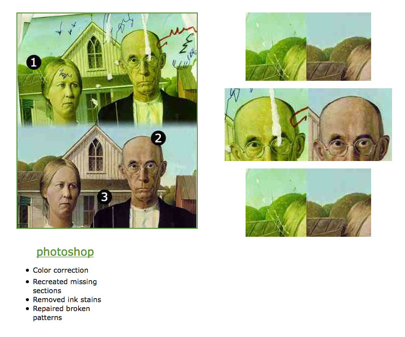
Some pretty creative damage on the “before” image, very Cy Twombly! This whole notion of color correction (and the link in the previous post’s comment to the article saying International Klein Blue was impossible to recreate onscreen) made me think of a work by Rachel Harrison (can’t find an image, unfortunately):
“An example of how cogently [Rachel] Harrison presents some of these concerns is seen in 5x7s (A&R Quality Photo…), 1996, for which the artist had the same negative of a[n] anthill developed at ten stores or labs, requesting an identical process and picture size each time. Each photo came back looking different, in a comically variegated range of hues, and one of the developed images was larger than the requested five-by-seven. Framed together they provide a witty commentary on the medium, on the production and reception of sameness, on the absence of a standard, even of standardization. Harrison opens up the potential of the situation to attempt to respond to the demands of a culture of too much. I don’t think the flux or absence is supposed to be deplorable or depressing.” (Bruce Hainley)
- tom moody — 3/28/09 @ 9:21 am
This is one of those finds that really puts you in the mind of someone who is taking matters into their own hands. It demonstrates the capacity to fake images in a way that is much smarter then showing a real “before and after”. In this case, the after becomes the before! The choice of destroying this digital reproduction creates a heightened aura around the image. I found myself experiencing a jarring response of empathy towards the possibility of this iconic painting being destroyed and the dedicated work that would need to be put into its conservation. The feeling of loss that I’m going through right now is so great that I am left wondering if something can ever return to its original state after even the slightest degree of alteration is performed.
I meant to link to the original page, http://crsvenningsen.com/portfolio_AmGoth.html.
Its a little different from the Rachel Harrison work in that there is 1 unique object that serves as an index for all reproductions of American Gothic. We are used to the variation that is tied into reproduction, but to me the Harrison piece has more to do with the agreement that the customer enters into with the photolabs. There is an absence of a standard, as Hainley writes, but the user has to be willing to accept what ever standard exists for the particular service that is outputting the reproduction.
Yes, this is a bit in the same genre as those wrinkle remover ads where someone takes normal lips and goes nuts adding hideous exaggerated wrinkles, which are then presented as the “before.” I suppose its possible the retoucher here found this yellowed image with the scribbling (not likely but let’s give it the benefit of a doubt) but then blows any authenticity by tilting it slightly in the frame. I mean, come on!
- tom moody — 3/28/09 @ 11:02 pm
Oh, and I saw your link recently with all the American Gothic parodies. The Whitney did a Grant Wood show years ago and the last room was a similar comprehensive selection of parodies. I’ve long been fascinated with icon/meme nature of that painting. I love how Wood transformed his sister Nan and the dentist B H McKeeby into this pioneer couple and that it resonated with people. I think it was the US ad industry that really caused it to take off in the ’60s.
- tom moody — 3/29/09 @ 8:34 am
SPRING BRAKE
- constant dullaart — 3/31/09 @ 4:48 pm
i meant girls gone wild of course
- constant dullaart — 3/31/09 @ 4:50 pm
http://www.artlex.com/ArtLex/a/images/amer.gothic_bradley_indian_lg.jpg
- eilis — 4/9/09 @ 7:47 am
RSS feed for comments on this post. TrackBack URI

nasty
internet |