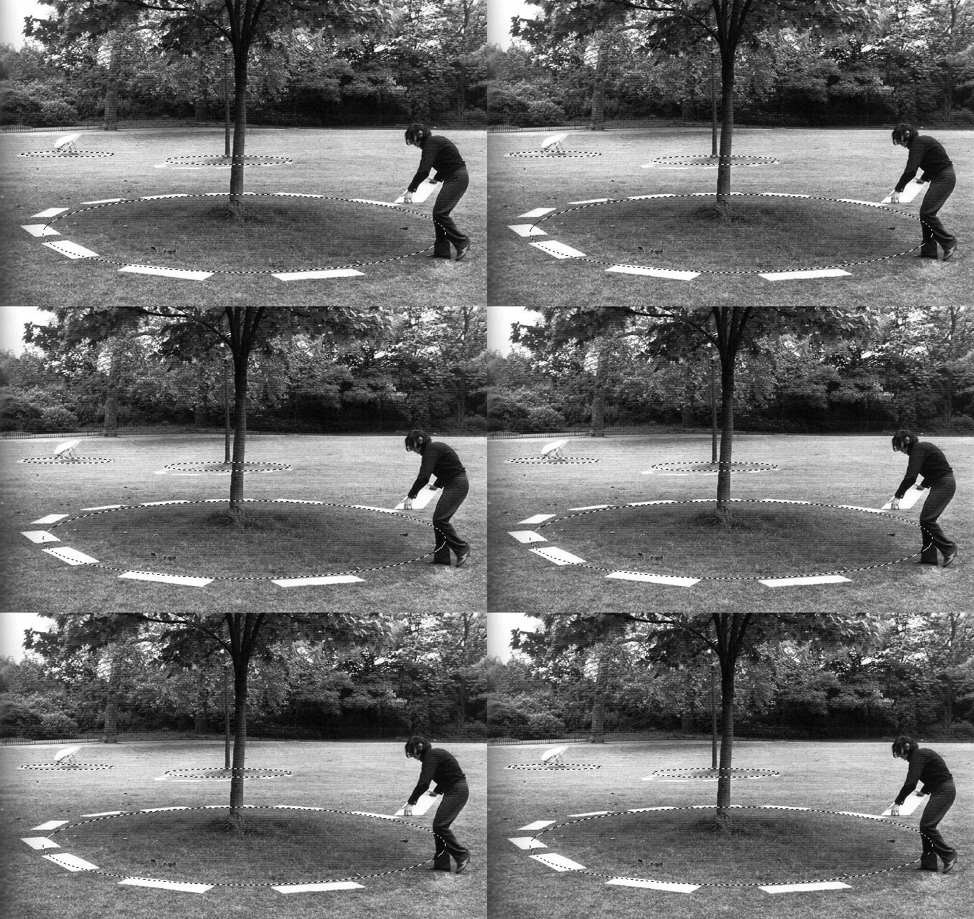
David Lamelas
Demarcating three objects, 1968
(Installation view, Hyde Park, London)


Ah, the conceptualist progenitor of “marching ants.”
- tom moody — 11/17/07 @ 3:32 pm
examples of use of the dashed line in infographics
Thats amazing, thanks Britta.
But…but…
“the dashed line has emerged from a designer’s shorthand and from the limitations of monotone printing techniques, it has a clear and simple visual magic, the ability to express something three- or four-dimensional in two dimensions.”
Neither Joel nor David Lamelas is using the dashed line in this instance to express something 4-D.
Lamelas is applying a simple graphic convention to nature (a kind of Pop art in space), and Joel is riffing on that with Photoshop’s moving 3-D line.
It’s true that Photoshop uses the dashes to say “cut here,” implying a future action, and it’s true that Lamelas is photographed in the act of sequentially laying down the dashes. But most people would not see the dashes as indicating motion in time–merely demarcating space in a graphically snazzy way.
*crickets*
- tom moody — 11/17/07 @ 6:34 pm
*crickets*
BUT
well put, but um… i think of it more like metaphors. Selecting individual objects on a cartesian plane. Lamelas is breaking the grid by using this metaphor in the real world (im attributing this to him 40years after the fact.. i know that he doesnt think of this piece having anything to do with technology..) and im using it as a token to bring it back to the 2-d. Like a double-negative.
Agreed that’s what you’re doing (I should have said “Photoshop’s moving 2-D line” instead of 3-D). I just butted in because the page Britta linked to, while graphically wow, injected a theme into the work (time) that I didn’t think was there, entirely. The ants aren’t really marching–more like running in place. Just playing metaphor cop.
- tom moody — 11/17/07 @ 8:09 pm
oh yeah, i didn’t think it was directly related (since this isn’t an infographic really). it reminded me of it, though, as a different use of the same visual element, which i think is neat!
- britta — 11/17/07 @ 11:10 pm
Sorry for the crudeness of this but I feel compelled to follow this non sequitur through to its conclusion: “Levitating Three Objects (In A Strong North Wind) (apologies to Joel and David)”:
- tom moody — 11/18/07 @ 10:16 am
Tom, I think u just made a Julie Mehretu.
POOR DAVID!

Yes, poor David, doomed to be a victim in a Gabber YouTube.
We may have something like Godwin’s Law here: “all attempts to depict the spacetime continuum eventually look like Julie Mehretu.”
- tom moody — 11/18/07 @ 1:30 pm
….and like everything else….
- Christopher — 11/19/07 @ 6:32 am
Just occurred to me that the angular movement of the objects in the “mehretu” could be caused by the earth’s rotation during levitation, so the “north wind” joke wasn’t completely necessary.
- tom moody — 11/19/07 @ 8:32 am
RSS feed for comments on this post. TrackBack URI